

Until now, I had a very specific idea of what an ideal teacher's ink should look like: at the time, I had just added Robert Oster inks to my range and had taken them to the Nuremberg Pen Show. There, all the guests at my booth were allowed to try out the inks. And relatively at the end of the show a gentleman came with his mother and both were teachers or the mother retired teachers. And when I showed them my favorite ink from the Robert Oster spectrum at that time - Fire Engine Red - they both laughed. And said it looked like "6 - set!". That sounded like an ideal teacher's ink!

But recently the inquiry came if I could suggest a nice red ink that would not be as garish as Pelikan 4001 brilliant red and would not be as dark as Diamine Oxblood. This was a challenge, of course! We therefore looked for which inks we could see in this spectrum.
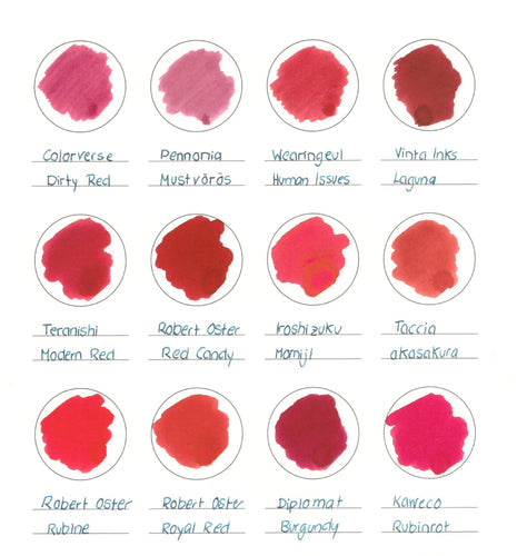
And this was not so easy, because finding a pure red is not easy. Bright reds tend slightly towards orange, warm reds are light with brown components. So it was also very exciting for us to try the inks that we thought were nice reds. You can find all the 12 inks we picked out in an ink watch.
And you can already see it there: quite quickly some appear pink or orange, like Colorverse Dirty Red, Pennonia Mustvoras or Taccia akasakura. In the end, our favorite was Robert Oster Red Candy. It's a beautiful intense red ink, but it seems very pleasing. Maybe with this red, students really pay attention to the corrections and learn something from their mistakes?
Second place is shared by two other inks: Vinta Inks Laguna and Teranishi Modern Red. Laguna is already a bit darker and Modern Red a bit lighter, almost a bit more washed out. But still intense enough to be noticeable.
But the other reds have their own characteristics as well: Iroshizuku Momiji shows the golden sheen with a slightly pink base tone. Robert Oster Royal Red is a red that pulls back a bit, much like Wearingeul's Human Issues.
So what's your favorite red corrective ink?

Comments
Auch ich habe mich schon durch etliche rote Tinten durchprobiert. Ich brauche sie für Überschriften und kürzere Texte, die sich vom Rest abheben sollen. Nun bin ich bei “Diamine Matador” gelandet – das ist ein für mich schöner, satter Rotton.
Salut,
die meiner Meinung nach optimale Tinte fehlt in der Auflistung. Es ist Garnet Red von Graf von Faber Castell. Es ist ein eher dunkler Rotton, der nicht so schreiend ist, sich aber klar vom Text der Schüler absetzt.